Updating an established logo that’s been in use for well over a decade and has been seen by tens of millions of people is never easy, and it almost always seems to make a significant contingent of regular readers very angry.
The again, many simply don’t care or won’t notice. If that’s you, more power to you, thanks for stopping by, and you can go about your day as the rest of this post will probably not be all that interesting.
Why Update The Logo At All?
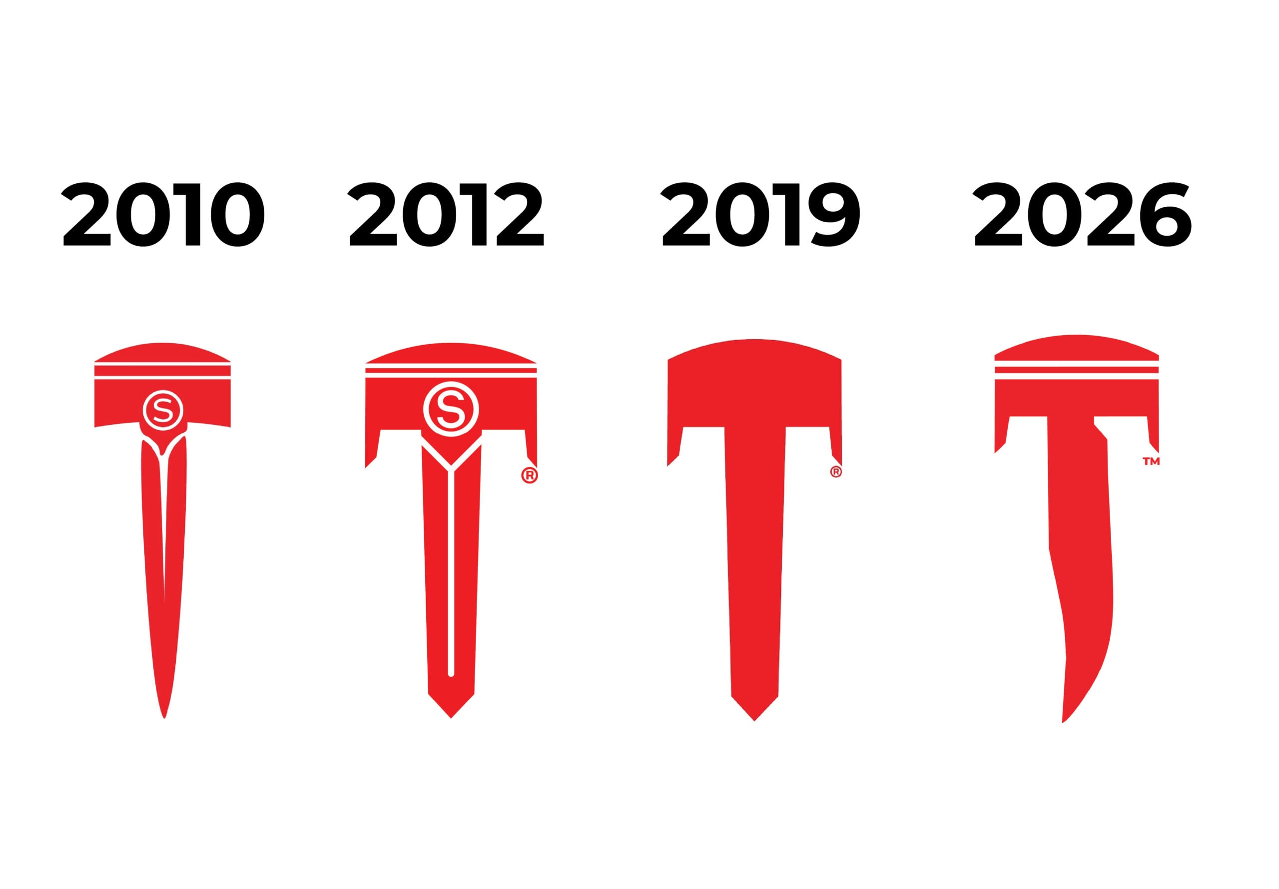
The key reason Silodrome needed to update the logo was that the current Piston Blade logo has a persistent problem, it looks too much like something else. When I first designed the logo back in 2010 it was still a piston with a blade where the connecting rod should be, to signify the combination of vehicles and gears/equipment/gadgets that we feature here on the site.
The color red was chosen for the redline on the tachometer.
The logo has had four major iterations, and you can see them pictured there above. That persistent problem I mentioned a little earlier is that the Silodrome Piston Blade looks too much like the Tesla logo. It certainly wasn’t deliberate, and the two logos are of very different things – the Tesla logo is a capital letter “T” for the company name, and it also represents one of the rotor poles within an electric motor.
Unfortunately, it seems unlikely that Tesla is going to change their logo. They have a $1.8 trillion USD market cap at the time of writing, and Silodrome’s market cap is still just slightly lower than that, so it falls to us to change our logo.
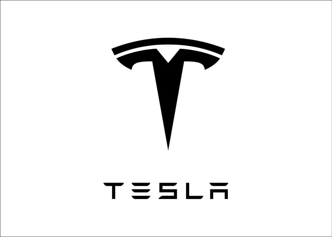
 As much as I’m loathe to admit it, there is a similarity between the older Silodrome logo and the Tesla Logo. Our hope is that the new logo will better separate the two. Legal Disclaimer: Tesla and the Tesla logo are trademarks of Tesla, Inc. All trademark and copyright rights remain the property of Tesla, Inc. Used here for editorial purposes only.
The New Logo Dilemma
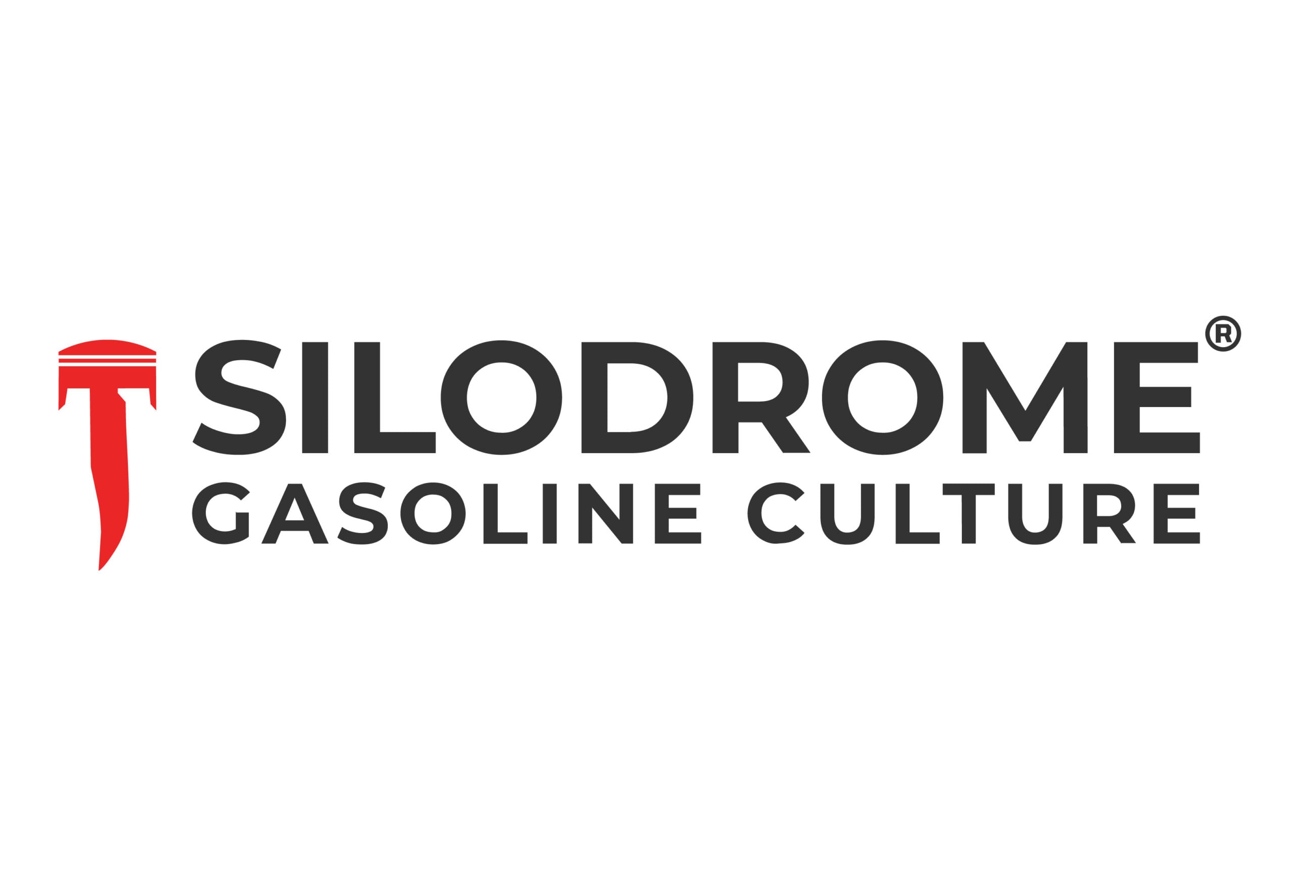
The logo dilemma we faced is that we really wanted to keep the Piston Blade, but just change it enough so that it no longer resembles anything else, even in passing. We decided to switch out the broadsword tip of the older logo design with a Bowie knife blade – it’s asymmetrical and it’s distinctive, even at a glance it’s clear what it is.
The piston also needed to be changed. We decided to keep the piston skirts in place while adding a coupe of piston rings and changing the shape of the top of the piston, adding canted sides that resemble valve recesses.
We did experiment with just using a single piston ring for simplicity, but it wasn’t enough to clearly show that it was a piston, and two rings plus an oil control ring was too cluttered. This is also why we left out the gudgeon pin.
We did consider dropping the blade entirely and switching to something else, but in retrospect I’m glad we didn’t. The key contenders were to replace the blade with a lightning bolt (already done by Deus), a ship’s anchor (already done by Iron & Resin), a car key (it looked confusing), or a tanto-style blade (again, it looked confusing).
The final logo is now different enough (hopefully) that no one will message me complaining that it looks like the Tesla logo, while still being similar enough to the original Silodrome Piston Blade that many won’t even notice it changed.
The site and all of the Silodrome social media channels were updated with the new logo today, and it should propagate out to readers as their browser caches refresh over the next couple of days.

In other news, we will also be updating our clothing store in the coming weeks with new designs that feature the new logo. The Silodrome Store was a surprising success when it launched, with considerably more sales than expected, and we have been holding off on releasing new designs until we had the new logo in place.
If you’ve read this far down, thank you for your time – in a world of never-ending doomscrolling and 24/7 notifications, one of the most valuable things a person can give you is their unfettered attention, and I appreciate it.
Yours Sincerely,
Ben Branch
Founder + Senior Editor – Silodrome

Articles that Ben Branch has written have been covered on CNN, Popular Mechanics, Smithsonian Magazine, Road & Track Magazine, the official Pinterest blog, the official eBay Motors blog, BuzzFeed, Autoweek Magazine, Wired Magazine, Autoblog, Gear Patrol, Jalopnik, The Verge, and many more.
Silodrome was founded by Ben back in 2010, in the years since the site has grown to become a world leader in the alternative and vintage motoring sector, with well over a million monthly readers from around the world and many hundreds of thousands of followers on social media.